")
– Home photos by Chad Davies –
Meet our designers:

PURE INDIGO INTERIORS – Photo by Sierra Ann Photography
Natalie Lynch and Ashlin Pickle are co-founders and designers at Pure Indigo Interiors. The duo were friends before becoming business partners. Pure Indigo is just over 4 years old, launched and run remotely from local coffee shops around town until they grew into an office space in midtown Fort Collins.
Female owned, with a team of six, they are now a full-service design company that enjoys the variety of projects their business brings: new builds, remodels, space planning, furniture selection, styling and consulting.
“In our designs,” says Ashlin, “we love using color, texture and natural elements together to create inviting spaces. Our designs are full of clean lines, textures and patterns, and we love spaces that are bright, light, fresh and full of softness.”

J. REIKO DESIGN + CO.
J. Reiko Design + Co. is a full-service interior design and interior architecture firm based in Fort Collins. Jenny Reiko Murphy, the founder and principal, has 10+ years’ experience working for design-build firms.
When she isn’t designing beautiful spaces, Jenny enjoys slow living with her menagerie of pets and home garden. She also has a great love for promoting health and wellness.
“While I was working my first job at a local design-build firm, I started researching and taking classes in holistic health and healing,” she says. “Originally, I thought this might mean a career change, but I quickly learned that there is a lot of overlap between interior design and human health and wellness…something that is always in the back of my mind when designing with my clients.”

Meredith Parrish Design
Meredith Parrish rounds out our three design teams. She is an award-winning Northern Colorado-based interior designer with 18 years of design experience.
She enjoys working on new-build projects but also has a passion for the unique set of challenges that a residential remodel brings.
Meredith loves designing in a range of styles, from Mid-Century Modern to Rustic Elegance and everything in between. Her latest favorite style is either Mountain Modern or an eclectic mix of modern and classic pieces. She loves working with clients who aren’t afraid to take risks and make bold choices, especially with tile, lighting and color.
Since 2020, Meredith has placed in the top three for Best Interior Designer in our annual Readers’ Choice Best of NOCO survey.
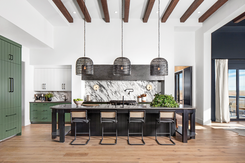
Designs by Jonathan and Kristina
Kitchen & Dining Room
Meredith Parrish Design
Favorite kitchen design: Jonathan and Kristina
Breaking it down: I absolutely LOVE the mix of green and black against the rustic wood floor! It has a mix of earthy and moody that makes me want to hang out in this space for a long time. Subtle details like the curve of the countertop on the island matching the curve of the lights add softness against the dramatic black finishes. The vertical grooves in the green cabinetry pull the eye up and accentuate the tall ceilings. Carrying the countertop up as the backsplash kept things simple in a kitchen that has a lot of other things happening.
Her runner up: I really loved the wood-stained arched pantry doors and herringbone wood floor in Michel and Anthony’s kitchen as well. The dramatic dark backsplash against the white cabinets was striking and I love that they had wall sconces on the range wall for something unexpected.
Design by Mitch and Page
Pure Indigo Interiors
Favorite kitchen design: Jonathan and Kristina
Breaking it down: We thought this kitchen was stunning, and agree with Jonathan and Kristina winning this challenge. A few of the features we loved were the oversized rounded island, the moodiness of the dining room and how it connected to the kitchen but also brought your eyes toward the outside, and the corresponding lighting chosen throughout the space. We love the pendant lights so much, we actually have one in our office! The sconces on the stone are so beautiful. We love the green chosen on the lower cabinets and would have loved to see the white cabinets in the same green color, or even black, as the white felt stark in the space. We loved the beams used in the dining area as they bring in the natural element, which is a big part of our design aesthetic.
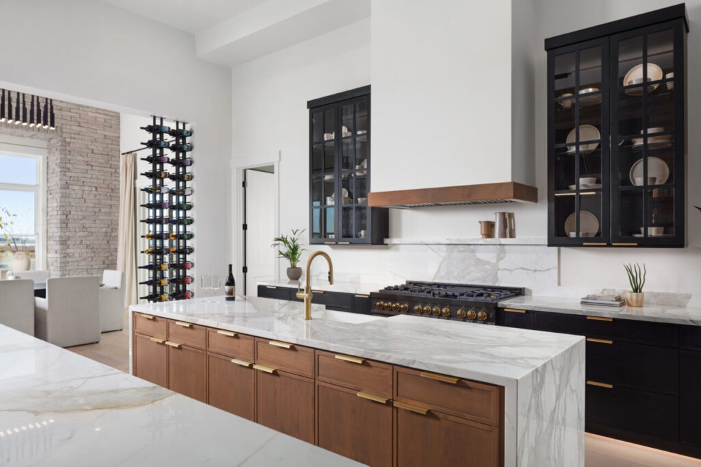
Design by Bryan and Sarah
J. Reiko Design
Favorite kitchen design: Mitch and Page
Breaking it down: I love their classic design with modern undertones and clean lines, and enjoyed their combination of natural/organic textures mixed with a perfect amount of structure and streamlined pieces. In a large space, I am always a fan of a double island. I think the custom wine partition between the kitchen and dining is a wonderful statement piece for a home of this caliber and adds a ton of visual interest to both rooms. I also appreciate that they didn’t try to take the upper cabinets in the kitchen to the ceiling in their design. In new builds with ceilings this high, it can be hard to achieve that cozy home feeling if nothing is grounding you in that large space. I think the use of dark glass uppers as an accent is great, but stopping at a lower height keeps the space grounded and welcoming.
Counter argument: I agree with the judges that Jonathan and Kristina’s design for the kitchen and dining was good, but it wasn’t my favorite. While they had a couple of good concepts (see below), I wasn’t the biggest fan of the finishes and color scheme they used. I think their secondary spaces are what helped them win this round.
Design elements to mimic: Jonathan and Kristina’s back-of-house pantry – This is a concept that I see trending currently because it accommodates a family or entertaining household so well. When I lived in Italy, this was a common concept, and I am excited to see it coming to America. I think it is a great way to maximize functionality, but also reduce the stress of having people see a messy workspace or interfere with your work zone when entertaining. I always recommend “working pantries” to clients that use countertop appliances regularly because you can leave them all out to use daily, but pull the door closed to hide the clutter of countertop appliances if you have guests.
Design missteps: Michel and Anthony – I did not like that they made the narrow upper cabinets in the kitchen go all the way to the ceiling. It creates a very vertical proportion in the space which doesn’t feel welcoming and makes the space look cramped. Cabinets that high are wasted space because they are hard to get to…and in some cases dangerous to get to.
Bryan and Sarah – I definitely agree with the judges that their chandelier selection blocks the beautiful view through the dining room window. I also felt the stone they used in the kitchen felt too top heavy. They should’ve used a lighter stone for subtle texture or incorporated the darker stone in a lower space to help ground it.
Designs by Jonathan and Kristina. (HGTV Winner).
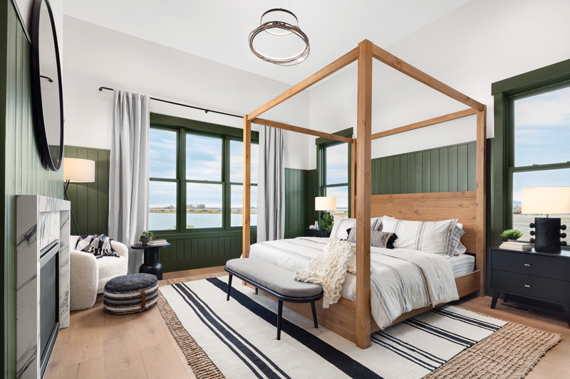
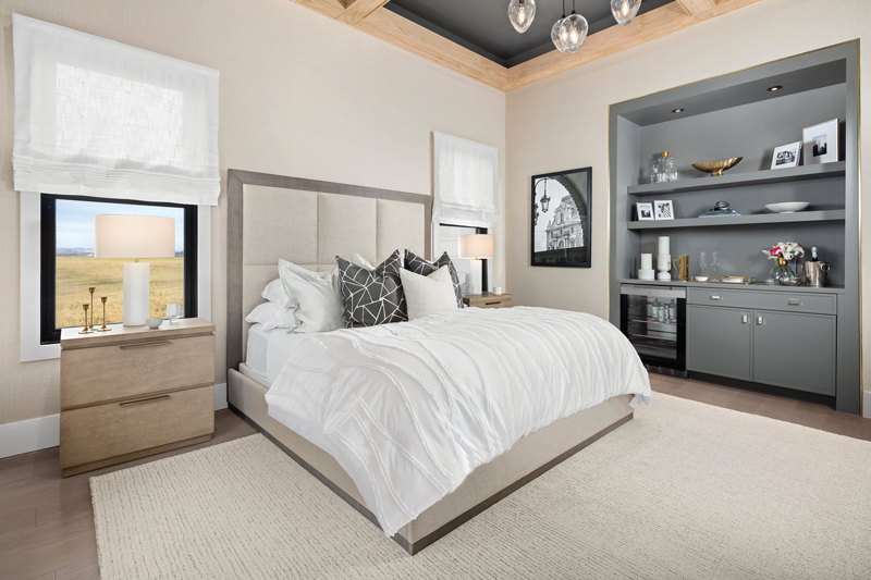
Primary Bedroom Suite
J. Reiko Design
Favorite primary suite: Jonathan
and Kristina
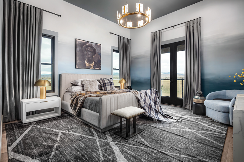
Breaking it down: This was a toss-up for me. I liked and disliked elements from all of them. Jonathan and Kristina would be my top pick, but I agree with the judges that they could have utilized the space in their closet better. I think they overused green a bit and I agree that the lasso light in the bedroom would be the first thing I would take down but loved everything else.
Design by Michel and Anthony. (HGTV Winner)
Design elements to mimic: Michel and Anthony – I loved the private deck addition they did that can be directly accessed from the bedroom. Private decks and balconies are great for homeowners to be able to relax and unwind with sprawling views of Colorado’s beauty.
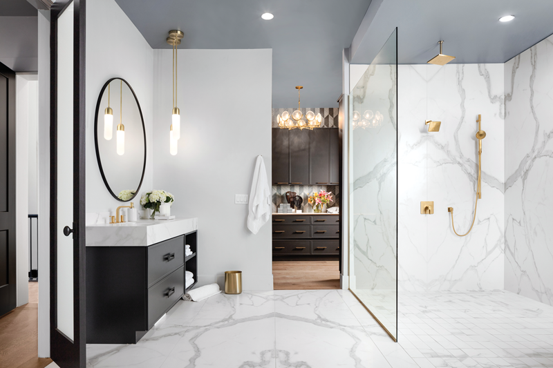
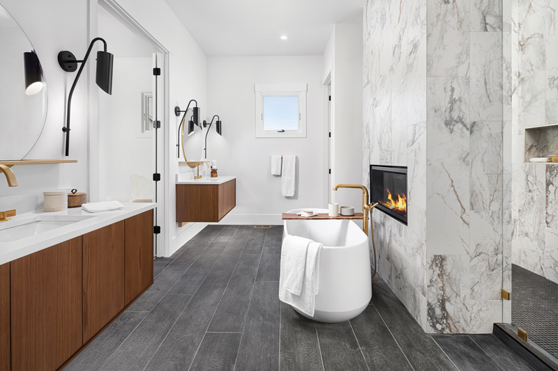
Mitch and Page – I was a huge fan of the fireplace they put above the tub in the bathroom. It adds an extra element of warmth to the bathroom, which can be a hard space to create that cozy feeling because it is typically filled with a lot of hard finishes (tile, countertops, etc.). Overall, I thought this was a great way to create a sense of warmth and relaxation in the bathroom. I also loved that they had a full laundry space adjacent to the closet.
Design by Mitch and Page
Bryan and Sarah – Adding a coffee bar (or wet bar) in a main suite is next level. I love adding this to clients’ homes when they are seeking a bit of extra private time in the morning or a quiet space to wind down in the evening. Typically, bedrooms are only used for sleeping, so I think adding a bar or fireplace really helps create a space that provides function beyond just sleeping.
Design by Bryan and Sarah
Design missteps: Michel and Anthony’s bathroom finishes seemed very harsh and cold to me. Also, I was not a fan of the urinal in the main suite. I could see a urinal in a basement or bar atmosphere but not in a main suite where you want it to feel elegant–gives me some dive bar vibes.
Designs by Michel and Anthony. (HGTV Winner)
Meredith Parrish Design
Favorite primary suite: Jonathan and Kristina
Breaking it down: I love the layered rugs and the stripe rug that pulls the eye towards the windows and the great view outside. I love that they brought the green back into this space in a wall treatment repeating the vertical line from the green kitchen cabinetry.
Design by Bryan and Sarah
Pure Indigo Interiors
Favorite primary suite: Jonathan and Kristina
Breaking it down: For us, while it was beautiful, the main suite that won felt a bit more modern than the typical “Colorado” style, which is why we preferred Jonathan and Kristina’s design.
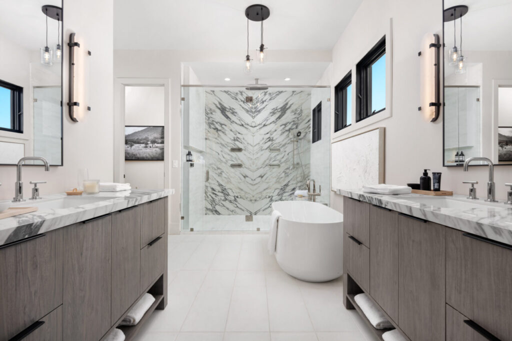
We loved their use of color, the natural woods and wainscoting everywhere to make a big impact beyond just an accent wall. The tones of the bed really warm up the room against the green tones, and the room has a ton of texture between the paneling, fabrics and mixture of materials. The lamps used are very interesting, which we liked to see. In the bathroom, we loved the lights, the marble with warm wood tones and darker floors. We love a high contrast look and warming it up with wood tones. We also loved the pop of color in the shower.
Design elements to mimic: We loved seeing the washer and dryer in the main closet. The space overall is so functional, which is so important to us in design. Our design advice here would have been to add more storage instead of a sink in the space, as that has higher functionality.
A little critique: Some of our design advice in their space includes using the black vertical brick instead of the stone and continuing it all the way up to the ceiling to draw the eye further up. We would love to see larger light fixtures, as the ones used feel smaller than what we would have chosen. In regard to the wainscoting, while we loved all over for a big impact, we prefer not to cut the room in half with it, so we would have loved to see it 2/3 or ALL the way up.
The light in the middle of the bathroom feels unnecessary and off scale (small), and the tub shape feels traditional compared to the overall design. We would have loved to see waterfall counters on both edges of the sink for a more balanced look and would have painted the windows black for consistency with the rest of the design. If we were designing in this space, we would love to use patterned or darker color curtains to frame the windows as a feature instead of the curtains blending into the wall.
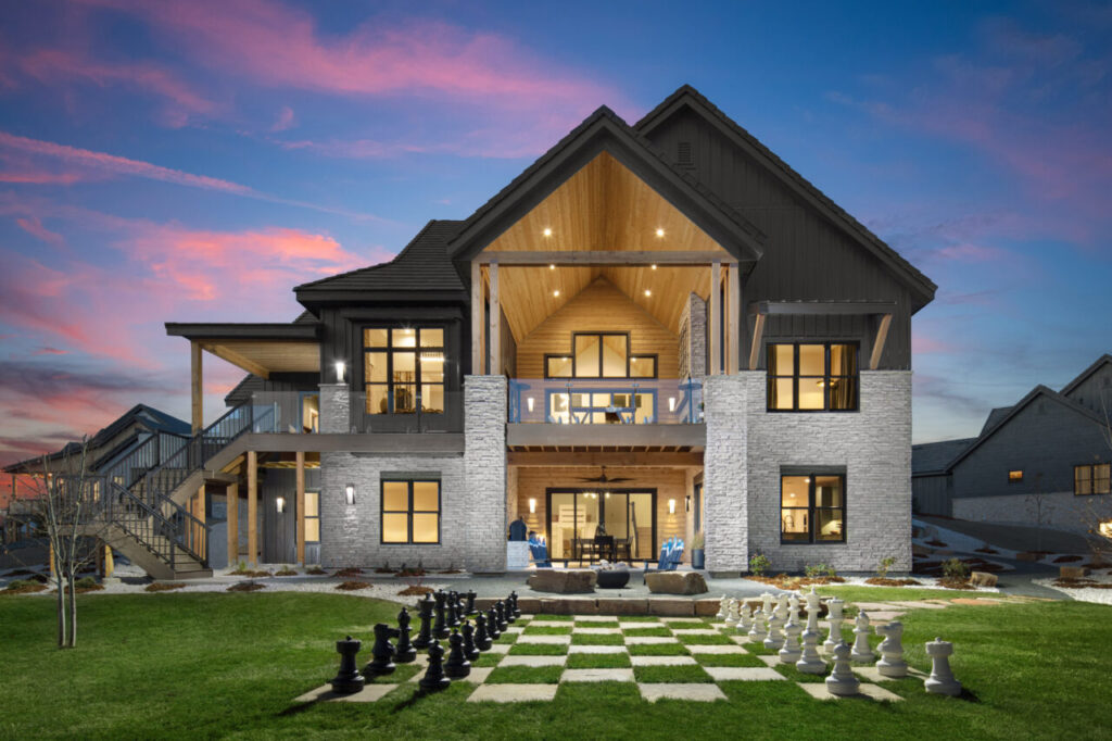
Design by Jonathan and Kristina
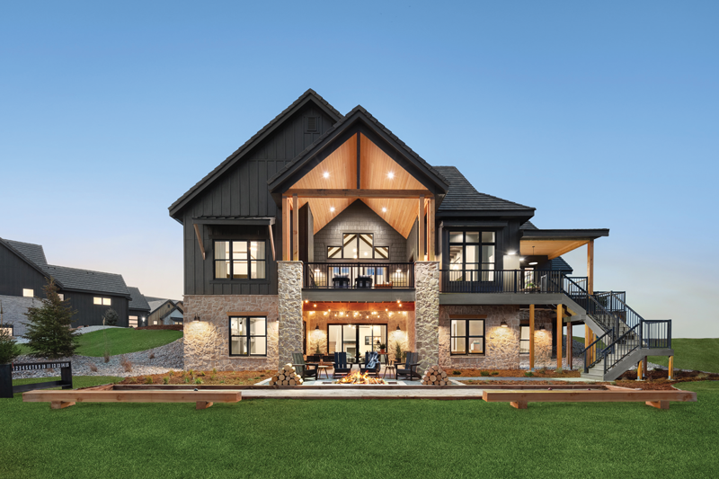
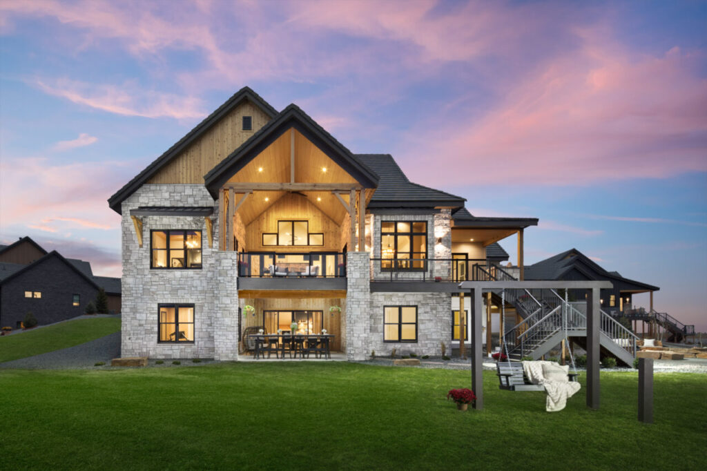
Outdoor Living Space
Pure Indigo Interiors
Favorite outdoor space: Jonathan
and Kristina
Breaking it down: We love the neutral colors, and how welcoming and classic the exterior feels. Again, we always love a black and wood combination. The accordion doors for an easy transition from inside to out is such a great feature for Colorado, and we loved the outside bar. We think that is a feature perfect for the Northern Colorado lifestyle. The yard game felt very family-friendly and the multiple eating areas and the fire pit make the space great for hosting.
As far as exterior finishes, we loved the stone and the irregularity of the pattern, the wood headers over the windows for a nice mountain touch and the wood ceiling on the upper deck. The exterior and outdoor spaces enhanced the already stunning views, were perfect for entertaining and family living and were so beautifully done, which is why we would have selected them as the winners.
Design by Michel and Anthony
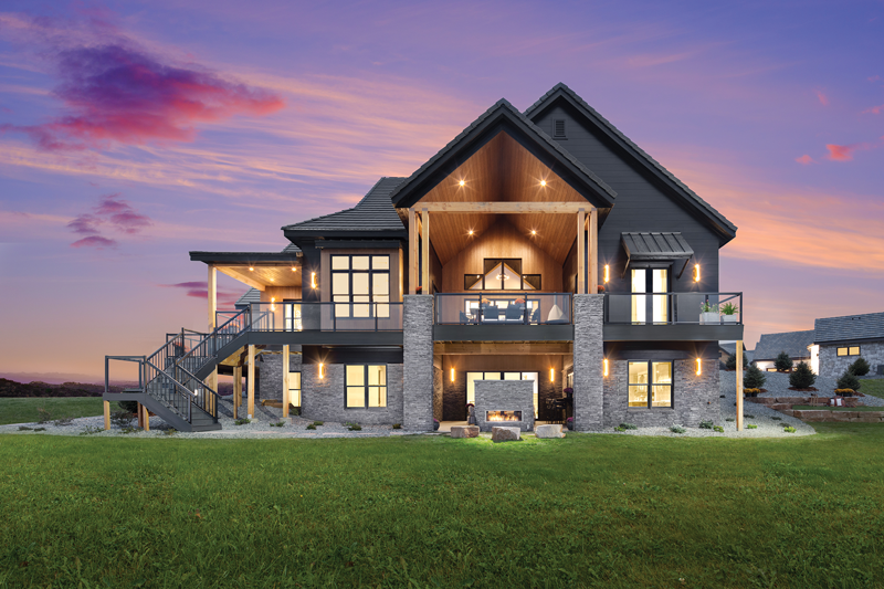
Meredith Parrish Design
Favorite outdoor space: Jonathan
and Kristina
Breaking it down: Great balance of textures here. I love the dramatic black vertical board and batten against the natural stained wood ceiling and teak wood furniture, again repeating that balance of earthy and moody. The bold patterned rug adds some interest and coziness, really taking this space from an outdoor deck to more of an extension of the indoors. You always hear people say, “bring the outdoors in,” but in this case it really feels like they brought the indoors outside extending the living space further. The plants bring that pop of green that is sprinkled throughout the indoors, again adding to the sense that this space is connected to what is happening inside the home.
J. Reiko Design
Favorite outdoor space: Jonathan
and Kristina
Breaking it down: I disagreed with the judges on this one. I felt like Bryan and Sarah’s was my least favorite, so I would’ve chosen Jonathan and Kristina’s as the winner this round. I love that they use a mix of exterior siding styles but painted them the same color. It gives the house some dimension but keeps it a bit more modern. The one change I agreed with the judges on was that the bar seating would’ve been better if it were placed at the railing so you can eat and enjoy the views instead of staring at the side of the house.
Design elements to mimic: Michel and Anthony – The projector/movie screen is such a fun idea. I love anything that helps people enjoy spending more time outdoors. This is a unique but fun way to incorporate another outdoor activity.
I loved all of the fire pits and fireplaces that everyone incorporated. Again, I think having those heating elements really makes the spaces more usable in the changing seasons. Because of the dry climate, even the summer nights in Colorado can be brisk so having a fire pit or fireplace is perfect.
Design by Bryan and Sarah. (HGTV Winner)
A little critique: Mitch and Page had too much black on the exterior. Black exteriors don’t hold up well in Colorado because of our intense sun exposure. Not only does it make the house hot in the summer, but the constant sun exposure on a color as saturated as black means that you will be dealing with fading, cracking and added maintenance over time.
Michel and Anthony – I agree with the judges that the double-sided fireplace really obstructs the mountain view.
Bryan and Sarah – The exterior finishes and architectural massing were too chopped up and busy for me. I prefer a bit more modern aesthetic. I don’t love the contrasting mortar on their exterior stone. I always prefer a softer look, so your eyes are drawn to the color and texture of the stone and not to the mortar joints. I also didn’t like that they spent the money to do a built-in grill and outdoor kitchen area but placed it on a corner where the countertop doesn’t tie into railing or some type of backsplash. I just picture people dropping or accidentally pushing plates, spatulas, drinks, etc., off of the edge.
Design by Mitch and Page
_______________________________________
Angie Grenz is editor of NOCO Style.