Song lyricist Tom Waits may have counseled putting a new coat of paint on a fading relationship, but his “scribbled lovedreams” are no match for the hot and heavy feelings homeowners have about sprucing up their nests, often with a trendy new tone.
Keeping a finger on trend pulses is smart because that’s how a house refresh starts.
Kim Strope, vice president and designer for Savant Homes, believes paint transforms your look and style.
More than ever, today’s paint colors are geared towards creating a natural, comfortable feeling in your home.
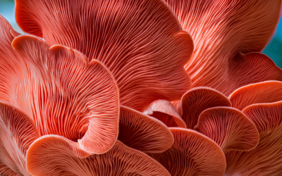
“Being in Colorado, any colors that you see on the outside that you can bring inside are trending—the colors of a beautiful fall, the rich greens, yellows, reds and browns in our landscapes. Bringing the outside in is popular in Colorado, even in winter where we have red rock, evergreens and the gray and neutral browns we live amongst,” Strope says. “These are calming colors, because getting out in nature is good for you. It’s also the colors of the sunset.”
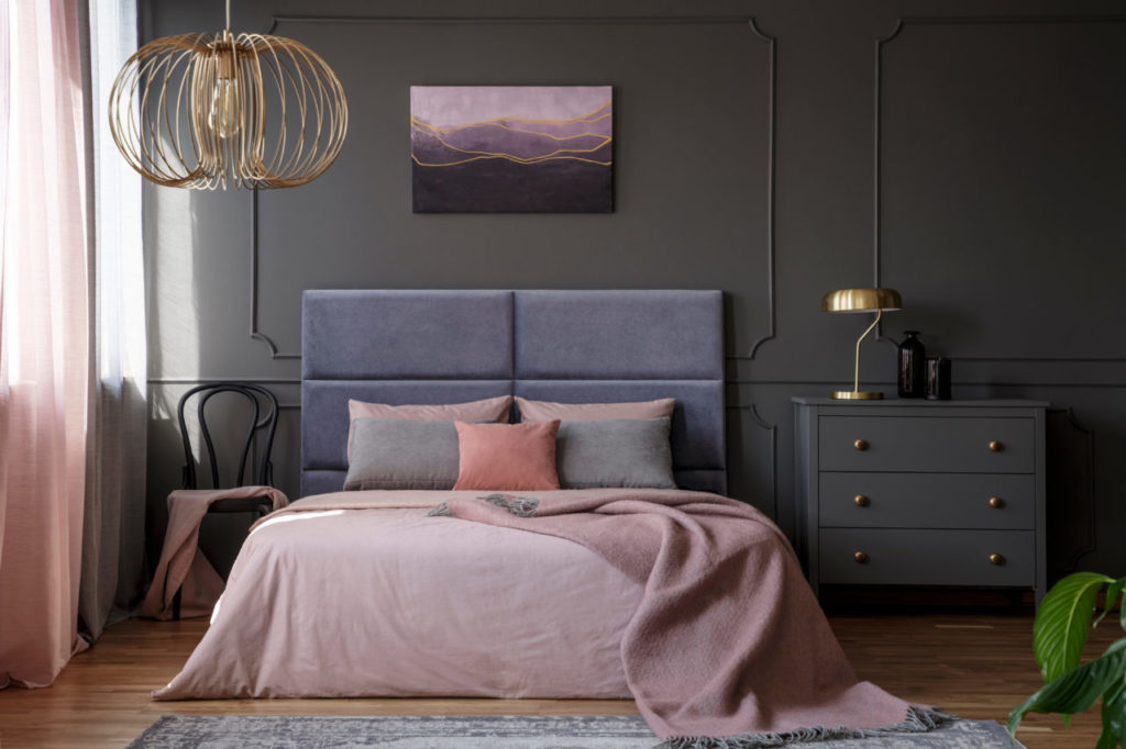
Gold lamp on grey cabinet next to pink bed in elegant pastel bedroom interior with chair
Alpha Design Group interior designer Lori McMurren notes that the word “organic,” another hot button right now, seems to refer to earthy tones, but asks, “What color can’t we find in nature? Blues and greens are shades that can make a natural pallet breezy and relaxing; pink undertones in paints make sage green and taupe accents feel warm and moody.”
The best bet? Get outside and find colors that fit the mood you want to live with every day.
Here are some other trends as you prepare your pad for a refreshing new paint.
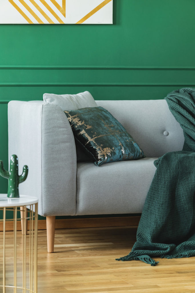
Emerald green pillow and blanket on scandinavian sofa in trendy living room
Color a mood
Painting on walls, flooring, cabinetry or using color on a statement piece of furniture can evoke cheerful, optimistic and energetic feelings, McMurren believes. There are also colors that are moody, cloudy or sleepy.
“The trick is using color as a well-edited accessory,” she says, using a deep, moody teal as an example. “If you painted the entire family room, teal might be a disaster—it’s lifeless, dim and sullen.”
Ultimately, it depends on the color and how you plan to use it in a space. Other light sources in the room should be factored into the equation to prevent a deep color from submerging the space into gloom.
“The color may not be the problem, but the amount it’s used probably is,” she says. “With a lighter neutral wall color, the teal could be beautiful on the interior of the bookcases or on a statement piece of furniture.”
One way to make colors pop is by using pure white for ceilings and trim casing, Strope suggests. But that monochromatic black-and-white palette is fading in popularity.
“There are beautiful ways to use pure white and black, but the farm or industrial style with shabby, deconstructed upholstery has come and gone,” McMurren says. “In design, there are never absolutes. There is always the art of using color in spaces, so we’ll always have these colors, but as part of a larger, more sophisticated theme. In particular, look for transitions to softer whites and more complex black shades.”
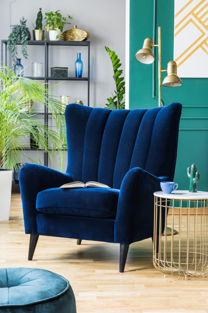
Big comfortable blue armchair next to stylish coffee table
Bold or bright?
The room size won’t determine whether it can handle bold tones—like black, charcoal gray or heavy brown, Strope says. McMurren thinks bold colors on built-in cabinetry can be transformative and are equally striking in a small room, like a powder room or den. Bold colors can also create a show-stopping dining room.
“When going bold, incorporate it into the whole space, with all the walls one color,” Strope says.
But boldness demands caution: A room with poorly selected color can feel chaotic.
If you fall in love with one strong color, also consider using it in upholsteries, accents and art. Today’s designers feel that one wall painted in an accent color isn’t interesting on its own, but colorful walls can be part of the full design plan for any room.
“The kitchen is a great place to splash brighter paints on cabinets, like a fresh blue—a fun option is to paint nook walls the same color as cabinets. It sounds repetitive, but planning the full design is critical. And using bold colors on wainscot paneling can modernize it,” McMurren says.
Keep the paint sheen in mind: more traditional or classic interiors, which she says are on the upswing, are stunning with high gloss paint. Bold, glossy color can highlight a ceiling when used with a more neutral-colored wall, but if you’re going for a contemporary style, consider a flat finish.
Neutral doesn’t mean beige
Strope says muted blues, greens, creams and browns are making a comeback, along with shades of green-gray. A neutral color can act as background music to a well-designed room.
But that doesn’t mean neutral is colorless, McMurren adds. “There are beautiful shades of white, soft taupe or soft, warm gray tones that I often specify dropping a lesser percentage of the shade I want to use to give the room a good foundation for new and varied updates and style changes.”
The best way to think of the word “neutral” is that it’s a color with less intensity. It might have more underlying brown notes, or a little pink or yellow, and the interaction of light in a room will pull out tones that you can’t always see from a paint chip.
The beauty of using neutral colors is it’s the perfect way to keep homes and businesses from looking too time-stamped.
“Neutrals are soft canvases that are timeless and permit other elements of the room to stand out,” McMurren says.
______________________________________________
Emily Kemme is an award-winning novelist and Colorado food writer.