– By Dawn Duncan | Photos by CassiHise Photography –
Freestone’s unique Mulberry project focused on Mid-century Modern design in a home that was built in 1959. Purchased by clients Shane and Lindsey in 2019, the two former Windsor residents relocated and began the assessment of what they wanted in a remodel.
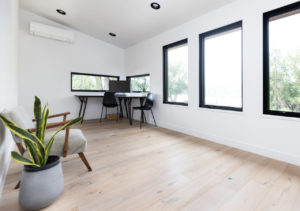
Cheri Freestone met the couple through a referral, after their architect had drawn up the initial ideas for the remodel. The couple work from home and it was important to create a space that functioned well in terms of separate office areas. The bones of the home were solid and the style fit Shane and Lindsey’s taste, which they described as modern/Mid-century Modern. They loved that the home was one-of-a-kind and that became the foundation for the design that took the project to the next level, literally, as they delved into a full home remodel that included a second-story addition.
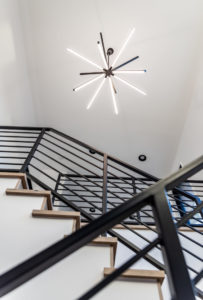
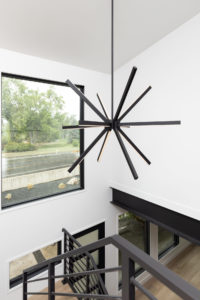
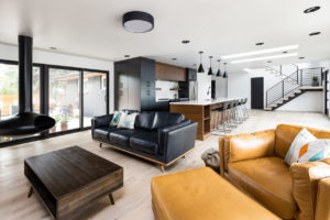
With a clear plan in place, Freestone set to work on a major renovation that would transform the home into a refreshed dwelling. The house was essentially gutted as the roof was removed to “pop the top” for the second-floor primary bedroom, primary bathroom and loft with custom metal staircase addition. Freestone also reworked all of the mechanical aspects of the home to meet code and increase energy efficiency. New windows, new skylights and large sliders (one in front and one in back) were added, creating a tremendous amount of natural light that can now stream into the home, giving the overall new design a more seamless indoor/outdoor living scenario.
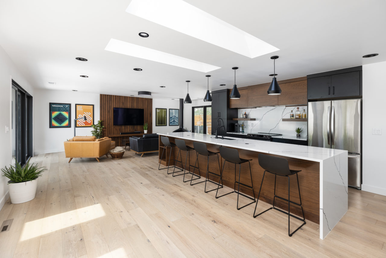
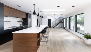
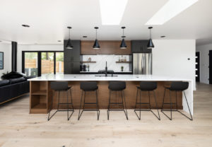
One of the most significant designs, in addition to the second story add-on, was in the kitchen. This was completely reconfigured, with custom cabinets and show-stopping quartz touches, such as an extra-long island with quartz waterfall edge and the quartz countertop flowing up the wall as the backsplash.
“When we met with Cheri at Milarc to pick out cabinets, she immediately took time to understand our style. She brought her design expertise to the meeting, incorporating what we like and envisioned, and the result is just stunning,” says Lindsey.
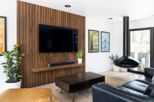
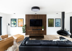
The two-tone, natural wood (walnut) and black cabinetry punctuates the new, sleek design of the kitchen, staying true to the MCM style, but with a burst of contemporary flair. The kitchen is also designed to offer seating, prep areas, ample storage and flow for ease of movement throughout. The reconfiguration of the kitchen created an entrance from the back of the house and garage, allowing them to install a new mudroom and laundry area. A nearby entertainment accent wall was also built with custom vertical walnut pieces and a ledge to add warmth and interest. The custom wall matches the rich walnut cabinets in the kitchen.
“The whole project incorporates our dream elements into it,” Lindsey adds. “We had a specific design taste and this was not only honored, it was elevated.”
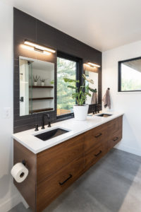
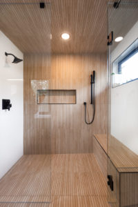
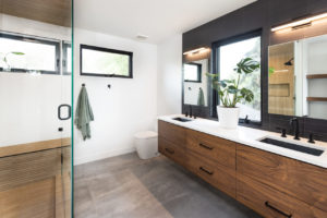
Another standout in the project was the primary bathroom remodel, which co-founder Scott Freestone took on eagerly, engineering solutions to the challenging design. Large 24” x 40” tiles were installed in the bathroom, even on the shower ceiling. Working with extra-heavy tile is not easy, but with Scott’s know-how, he made it happen and the room is now one of Shane and Lindsey’s favorite spots in the house. In addition to the unique tile installation in the shower, custom concrete matte black sinks tied into the matte black tile accent wall at the custom vanity, making every inch of this bathroom unique. Black can lights were added throughout the home, giving it extra brightness, but also adding to the minimalist and modern design aesthetic. What seemed like a small change actually significantly altered how the home looks and improved the overall effect greatly.
Along with the huge changes to the interior of Shane and Lindsey’s home, Freestone tackled the exterior as well. What once was a one-story dark brick house is now a modern two-story dwelling with white stucco, cedar accents and soffits, and black windows. The exterior was finished with black can lighting and matte black custom metal awnings, which tie the exterior together beautifully. Painting the home’s existing brick dark gray boosted its curb appeal and was a way to keep and honor an existing home element.
This was a major project in general, but being executed and completed in the throes of the pandemic, when supply chain shortages were rampant, added to the challenge. The result: two happy homeowners and a house that they are all proud of.
“The whole team worked so well,” Shane says. “Scott was very focused on details and he listened to all of our ideas. He didn’t say ‘no’ when ideas were perhaps unique or even difficult to achieve. He took them and spent time figuring out ways to make things work and that was appreciated.” From the initial walkthrough to the final completion of the project, this was one for the books, as it completely changed the entire look and feel, as well as functionality, of the home. Now, Shane and Lindsey, CSU alumni who spent time in City Park as students, have stellar views of the park that they love, as well as the gorgeous foothills, thanks to the second-story addition to their home.

